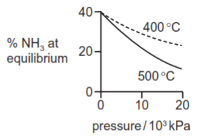
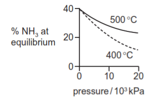
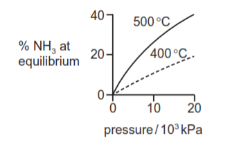
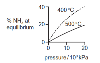
Graphs can be drawn to show the percentage of ammonia at equilibrium when nitrogen and hydrogen are mixed at different temperatures and pressures.
Which diagram correctly represents these two graphs?
1 )
2 )
3 )
تحلیل ویدئویی تست
منتظریم اولین نفر تحلیلش کنه!


پرسش و پاسخ های مشابه
سوال کنید یا به سوالات دیگران پاسخ دهید ...