The diagram below shows the annual rate of inflation in the UK between 2011 and 2014.
From the graph it can be concluded that between 2011 and 2014
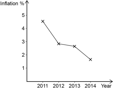
1 )
real wages increased.
the price level was rising.
3 )
the real value of money increased.
4 )
the UK experienced deflation.
تحلیل ویدئویی تست
منتظریم اولین نفر تحلیلش کنه!

پرسش و پاسخ های مشابه
سوال کنید یا به سوالات دیگران پاسخ دهید ...