The graph shows the annual percentage change in the prices of services and in the prices of goods between 2007 and 2012.
What can be deduced from the graph?
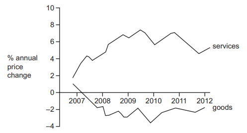
1 )
On average the price of services was higher than the price of goods throughout the period.
2 )
The average price of goods was higher in 2012 than in 2010.
The average price of services was higher in 2012 than in 2010.
4 )
There was a fall in the general price level between 2008 and 2010.
تحلیل ویدئویی تست
منتظریم اولین نفر تحلیلش کنه!