The diagram shows the change in an economy’s production possibility curve from year 1 to year 2.
What might explain the change from year 1 to year 2?
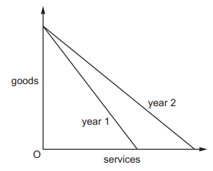
1 )
Resources have moved from the production of services to the production of goods.
2 )
The number of workers unemployed in manufacturing has fallen.
The producers of services have introduced better technology.
4 )
The workers in the production of goods have become less efficient.
تحلیل ویدئویی تست
تحلیل ویدئویی برای این تست ثبت نشده است!


پرسش و پاسخ های مشابه
سوال کنید یا به سوالات دیگران پاسخ دهید ...