The graph shows the annual % changes in the prices of new houses and existing houses in the United Kingdom between 2010 and 2012.
What can be concluded about the graph?
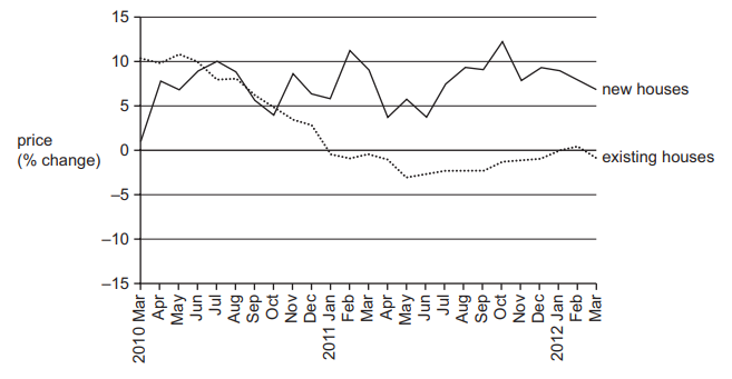
1 )
In the period after October 2010, new houses were more expensive than existing houses.
2 )
In the period up until January 2011, there was a steady fall in the prices of existing houses.
3 )
The average price of existing houses was lower in March 2012 than two years earlier.
The prices of new houses continued to rise throughout the period.
تحلیل ویدئویی تست
منتظریم اولین نفر تحلیلش کنه!


پرسش و پاسخ های مشابه
سوال کنید یا به سوالات دیگران پاسخ دهید ...