The diagrams show UK Government total spending and welfare spending in £ billions between 2005 and 2014.
What can be concluded from the diagrams about UK Government spending during the period 2005 to 2014?
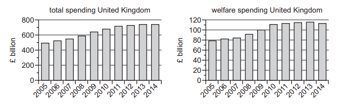
1 )
Both forms of spending were cut in 2014.
2 )
Both total and welfare spending have risen continuously.
3 )
In 2005 welfare spending made up a quarter of total spending.
Non-welfare spending has always exceeded welfare spending.
تحلیل ویدئویی تست
منتظریم اولین نفر تحلیلش کنه!


پرسش و پاسخ های مشابه
سوال کنید یا به سوالات دیگران پاسخ دهید ...