The diagram illustrates the production possibility curves for an economy in Year 1 $\left( {{X_1}{\text{ }}{Y_1}} \right)$ and Year 2 $\left( {{X_2}{\text{ }}{Y_2}} \right)$.
What can be concluded from the diagram?
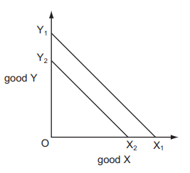
1 )
The cost of production was lower in Year 2 than in Year 1.
The full employment level of output was lower in Year 2 than in Year 1.
3 )
The opportunity cost of production was lower in Year 2 than in Year 1.
4 )
Unemployment rose between Year 1 and Year 2.
تحلیل ویدئویی تست
منتظریم اولین نفر تحلیلش کنه!


پرسش و پاسخ های مشابه
سوال کنید یا به سوالات دیگران پاسخ دهید ...